Product pages are the last thing your shoppers see before they make their purchase.
Or, if things don’t go as planned, the last thing they see before they hit the exit.
Let’s break down six stores from six different niches, each with stunning product pages. We’ll put their product pages — all of which were built with Shopify — under a microscope to see what they’re doing that you can replicate at your store.
The Standard Product Page
Chances are that whatever design template you use for your Shopify store, the product page backend will look something like this:
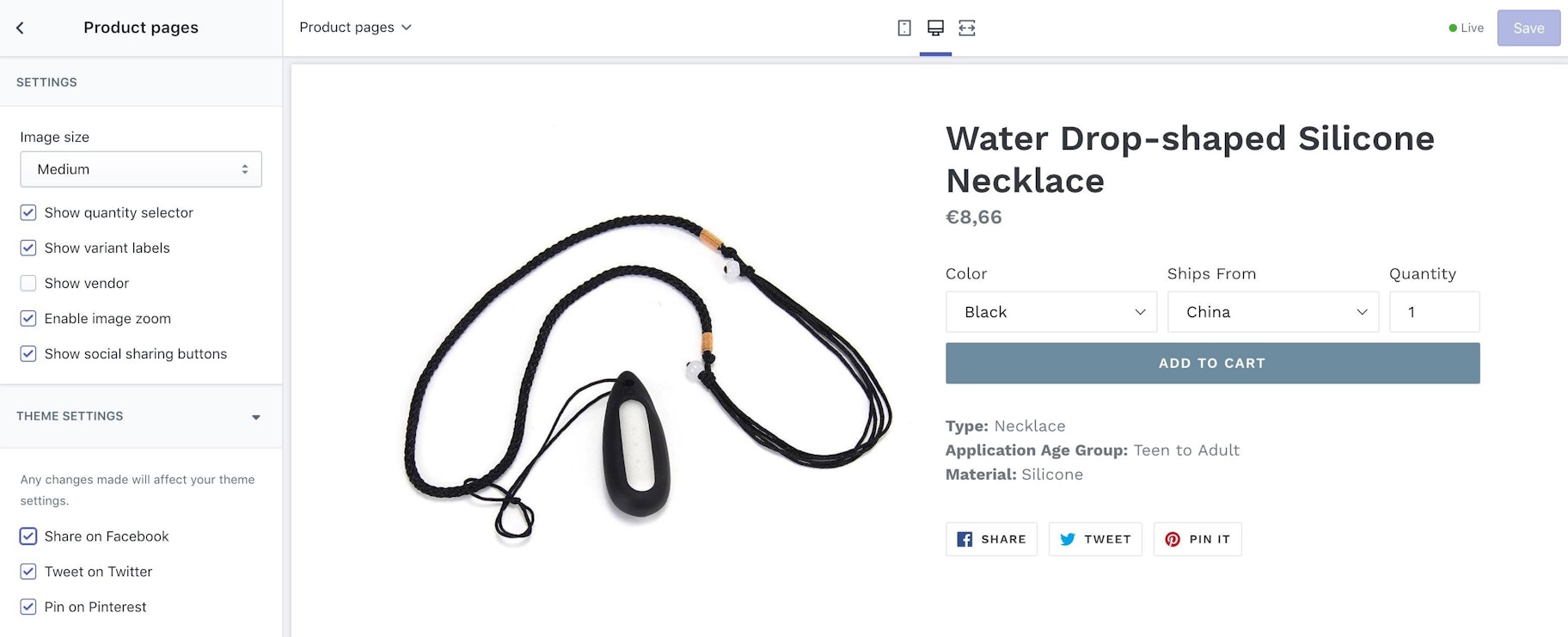
→ Click Here to Launch Your Online Business with Shopify
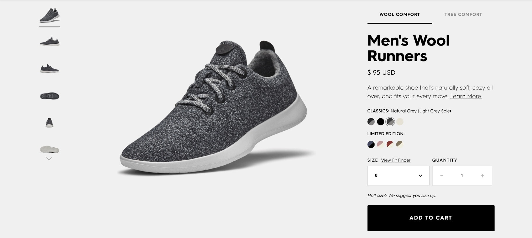
When pages like that are pushed live, they will more or less resemble this one:
But let’s look at how a handful of ingenious stores turn standard products pages into eye-popping Product Pages.
Allbirds
Allbirds, which sells shoes, created the product page we looked at above. You know, the normal-looking one.
But Allbirds’ product pages are only normal if you don’t scroll down. Once you dive in, you find some of the best product pages around.
There is lots to fawn over here. First off, Allbirds adheres to the old adage that “form follows function.” Namely, they have a product description that fits neatly in the space provided, next to the featured image, without disrupting the symmetry of the layout.
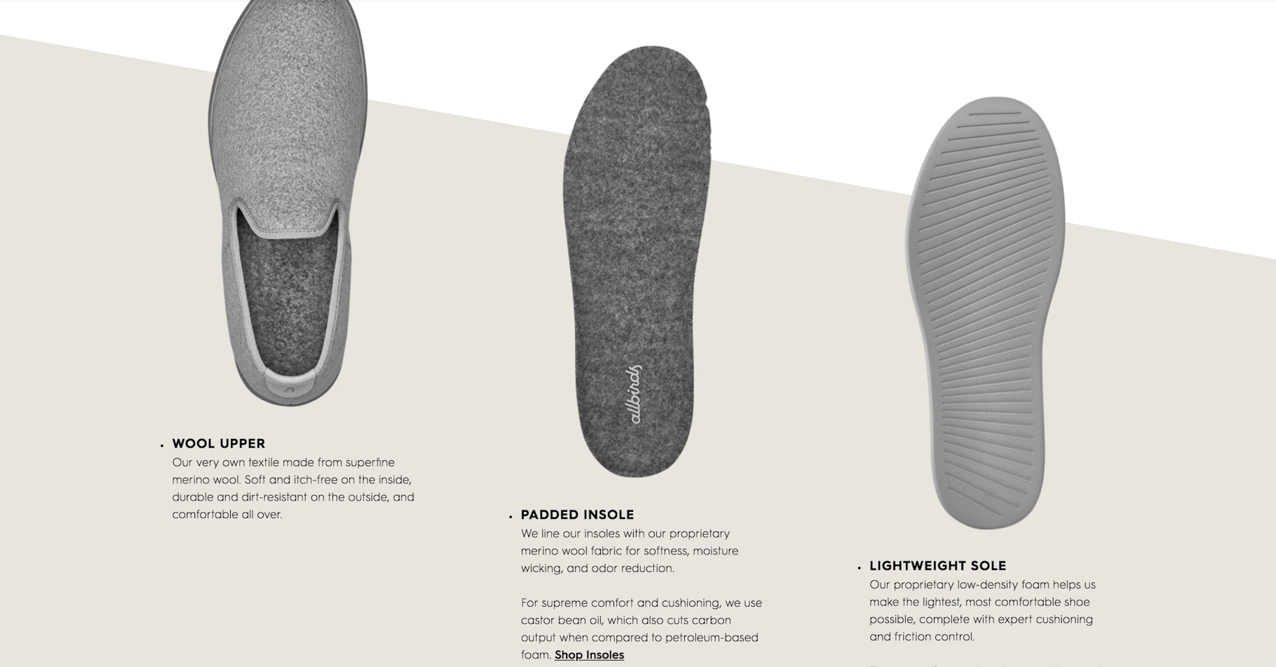
But there is no shortage of info! Because when you click on Learn More, you are redirected to an anchor lower on the product page.

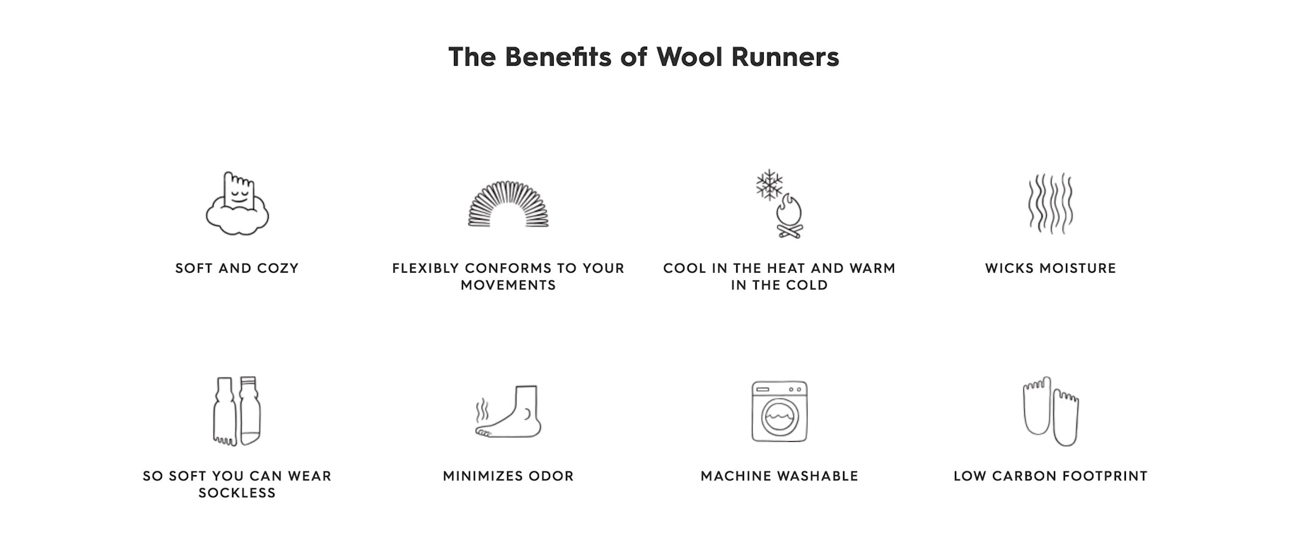
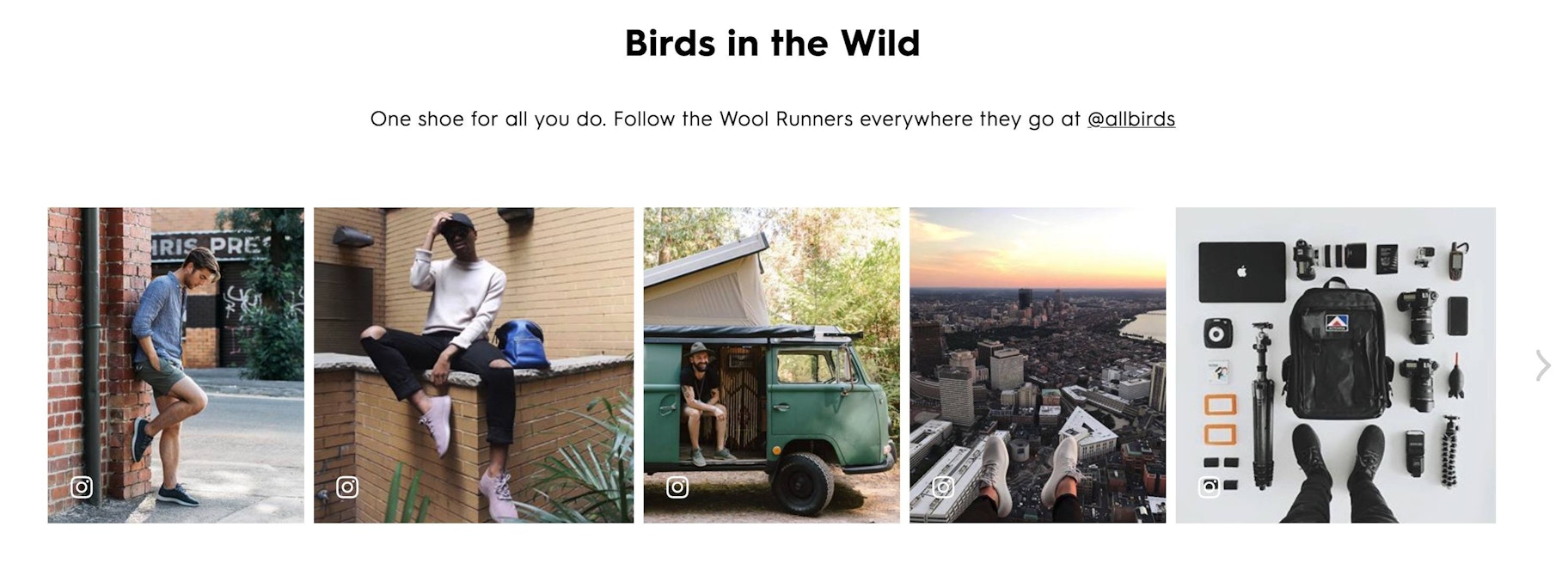
That’s where you’ll find a massive, colorful section devoted to the details that don’t fit cleanly on top:
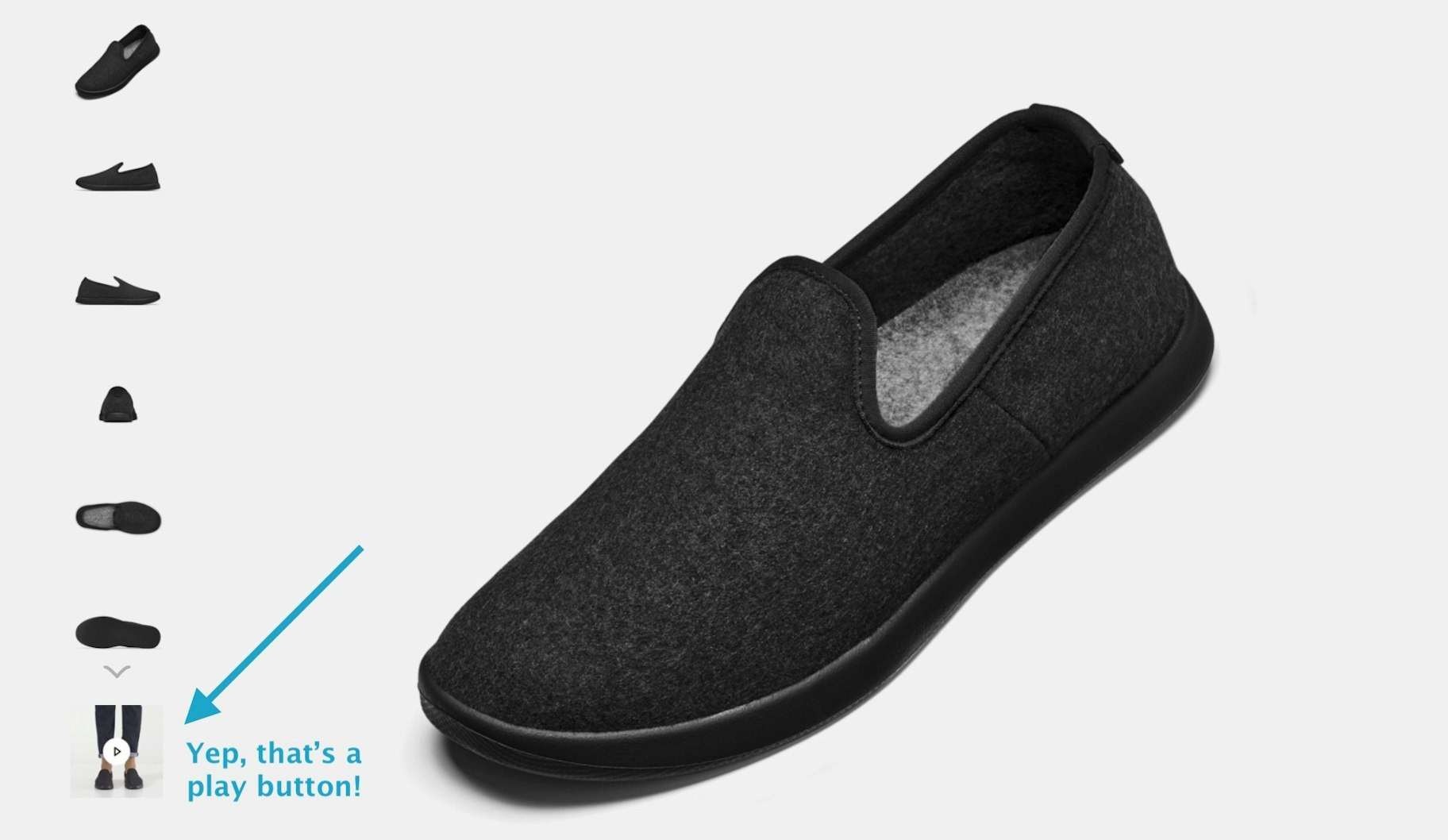
Another awesome thing about Allbirds’ product pages is the cheeky videos that they slip in:
When you click on that “image,” you are treated to a video instead of another product pic. The video is simple – it’s just a few seconds. No Emmy nominations here. But these sort of touches can revolutionize your product pages.
A couple more things to point out with Allbirds’ product pages.
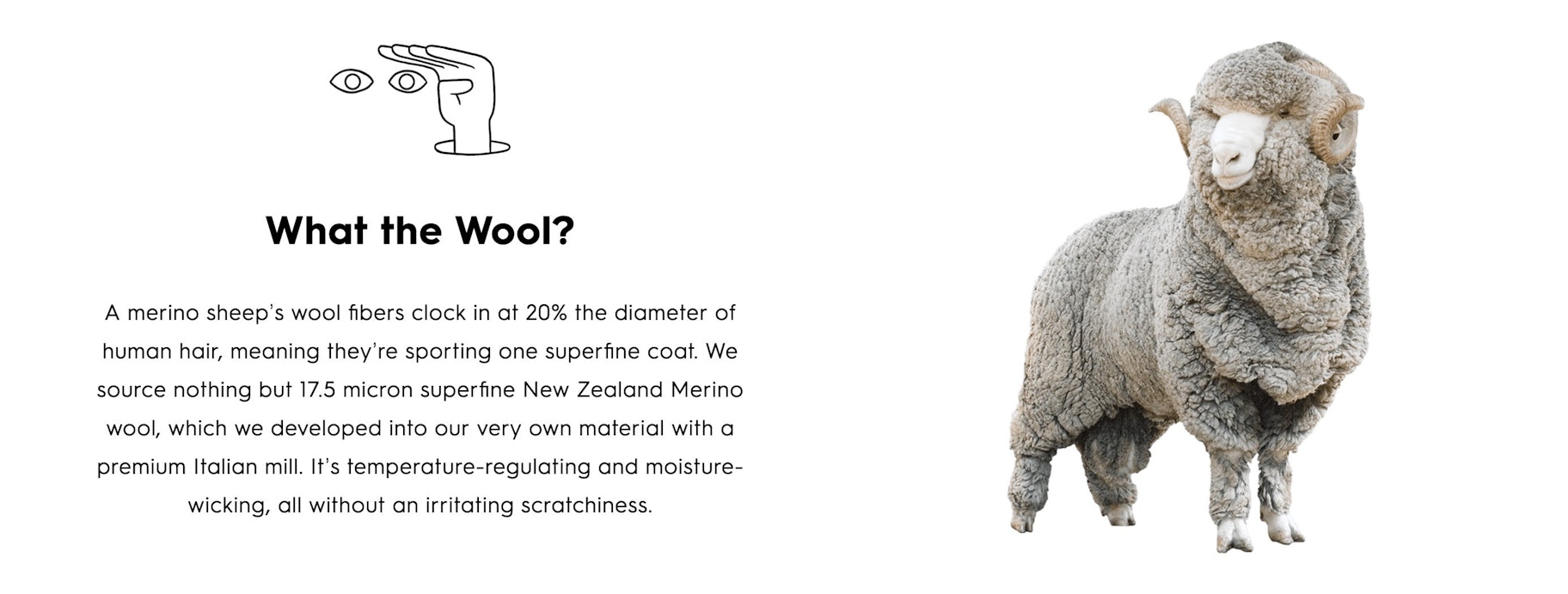
Want to make your product pages memorable? How about a big hi-def image of a bizarre animal:
Hem
Next up is Hem, a Scandinavian furniture brand. Hem employs some clever tactics for turning product pages into an experience all their own.
Alright, here is the basic product page –be the above-the-fold part. If someone had already decided to purchase, they could go ahead and place their order straight away.
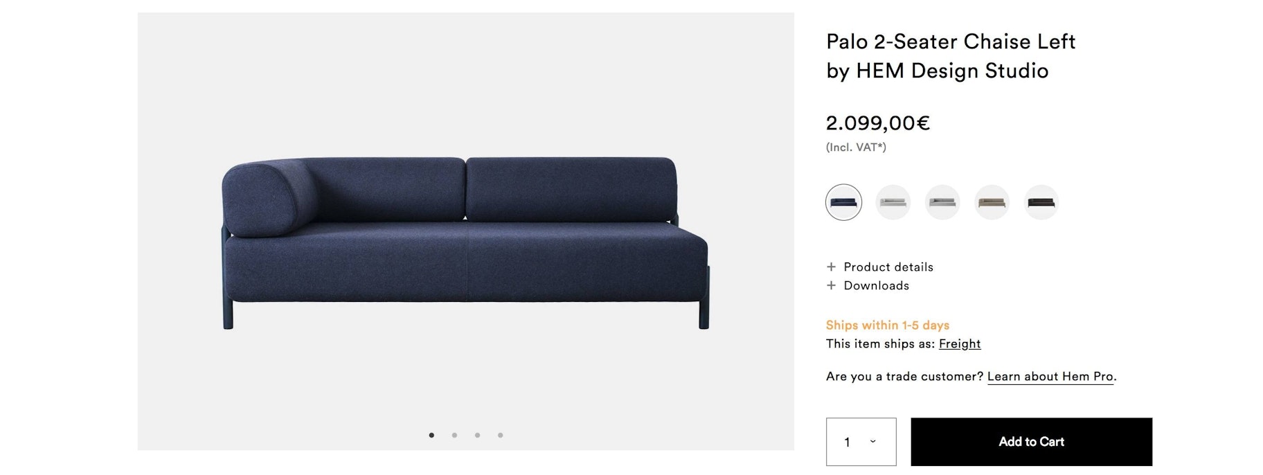
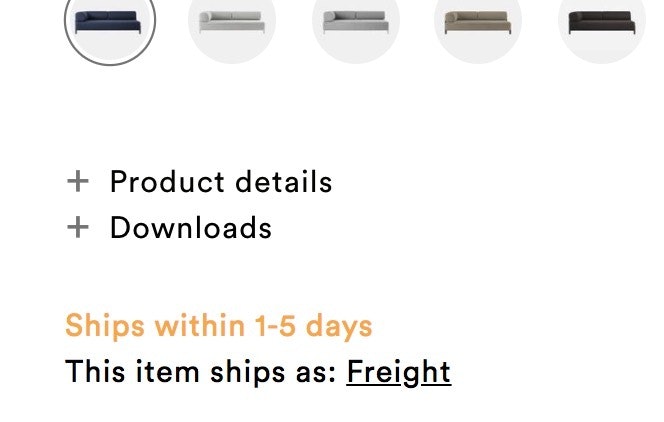
… turns into this:
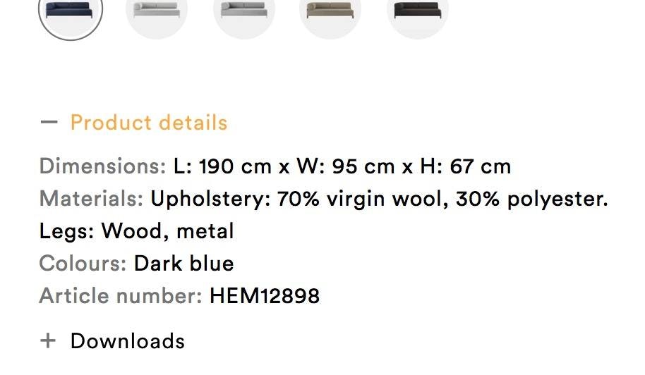
This layout makes it so you don’t have to scroll down to get any vital information. Of course, if you do scroll down, things get pretty interesting.
These are the first two images you run into: one is a video, the other a cactus.

And then the video. Once again, this is not film festival-level videography. But it is moving images, and people love moving images. The 26-second video shows the couch from myriad angles and illustrates how easy it is to construct.
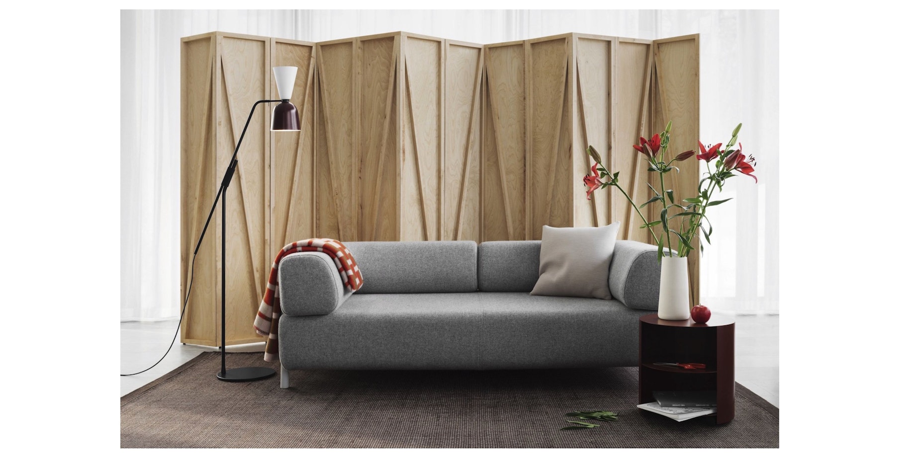
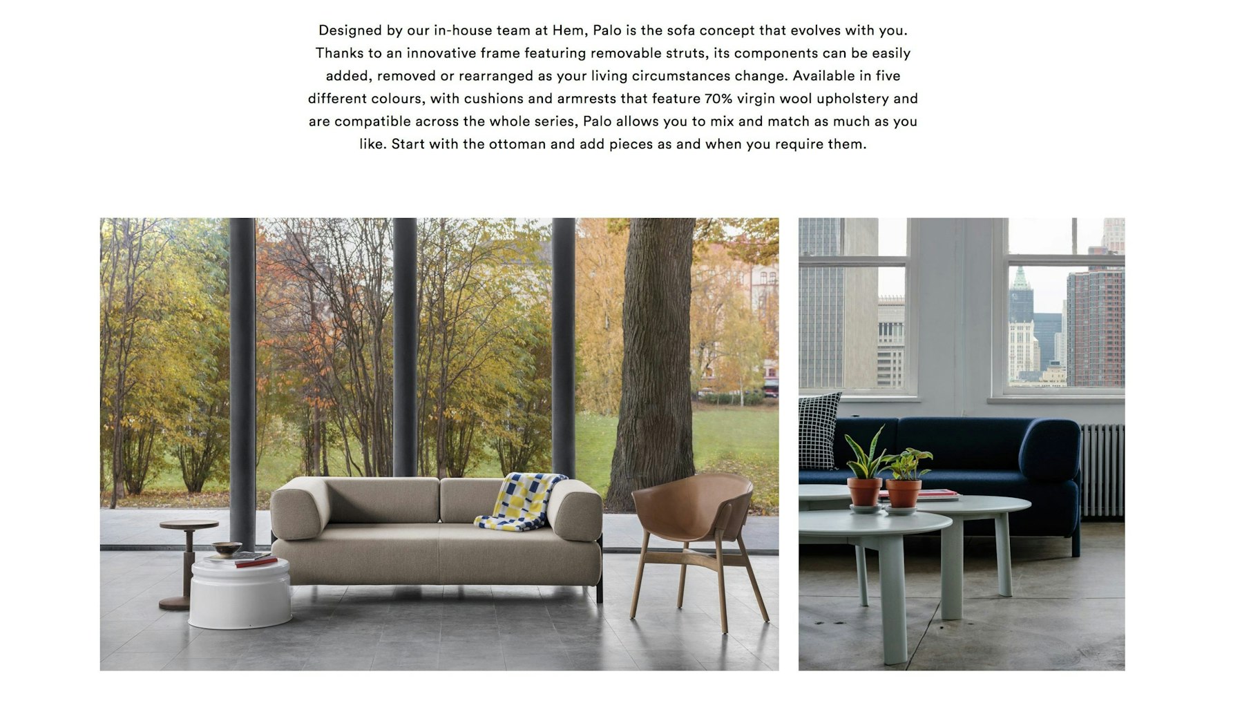
After that, more pics – big, gorgeous pics – with a dash of written word to give shoppers any details they might be missing.
Pure Cycles
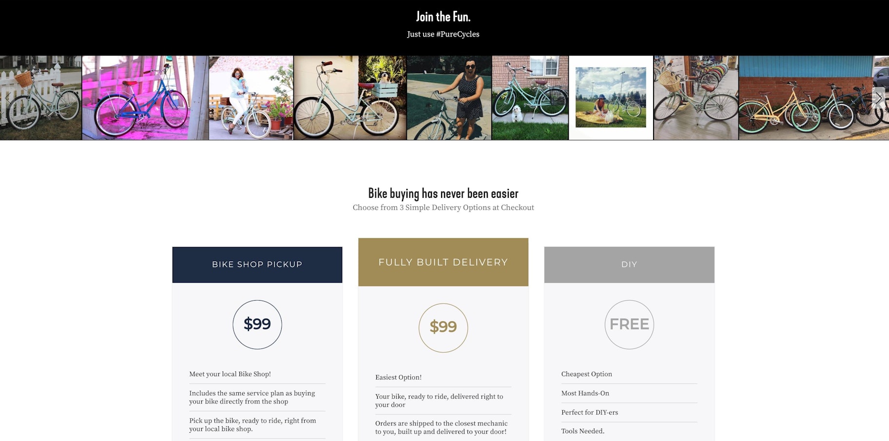
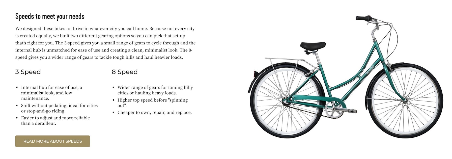
Bike creator Pure Cycles incorporates more than a few nifty elements into their product pages.
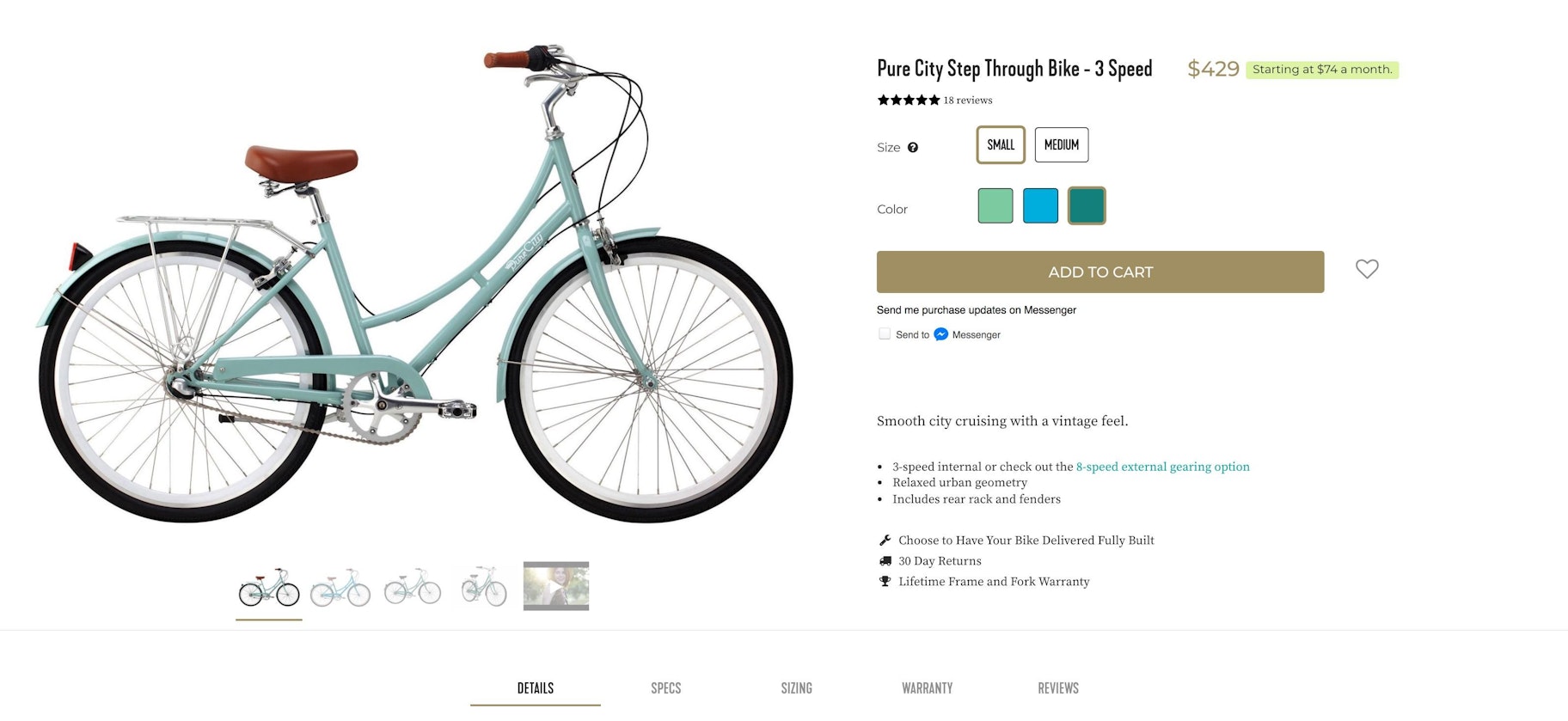
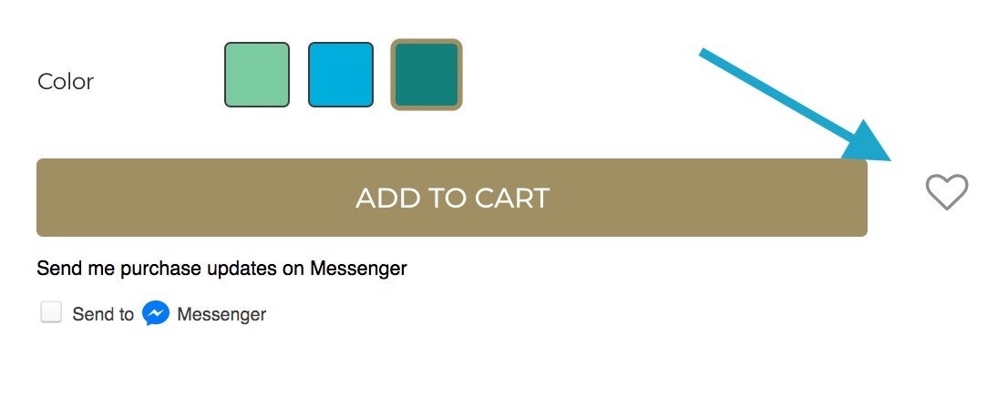
1. This little heart
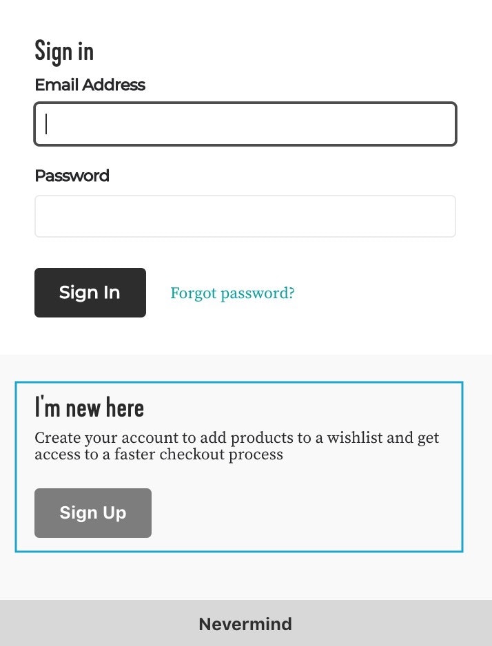
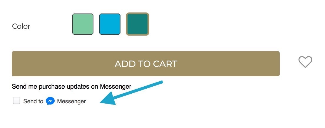
3. More content!
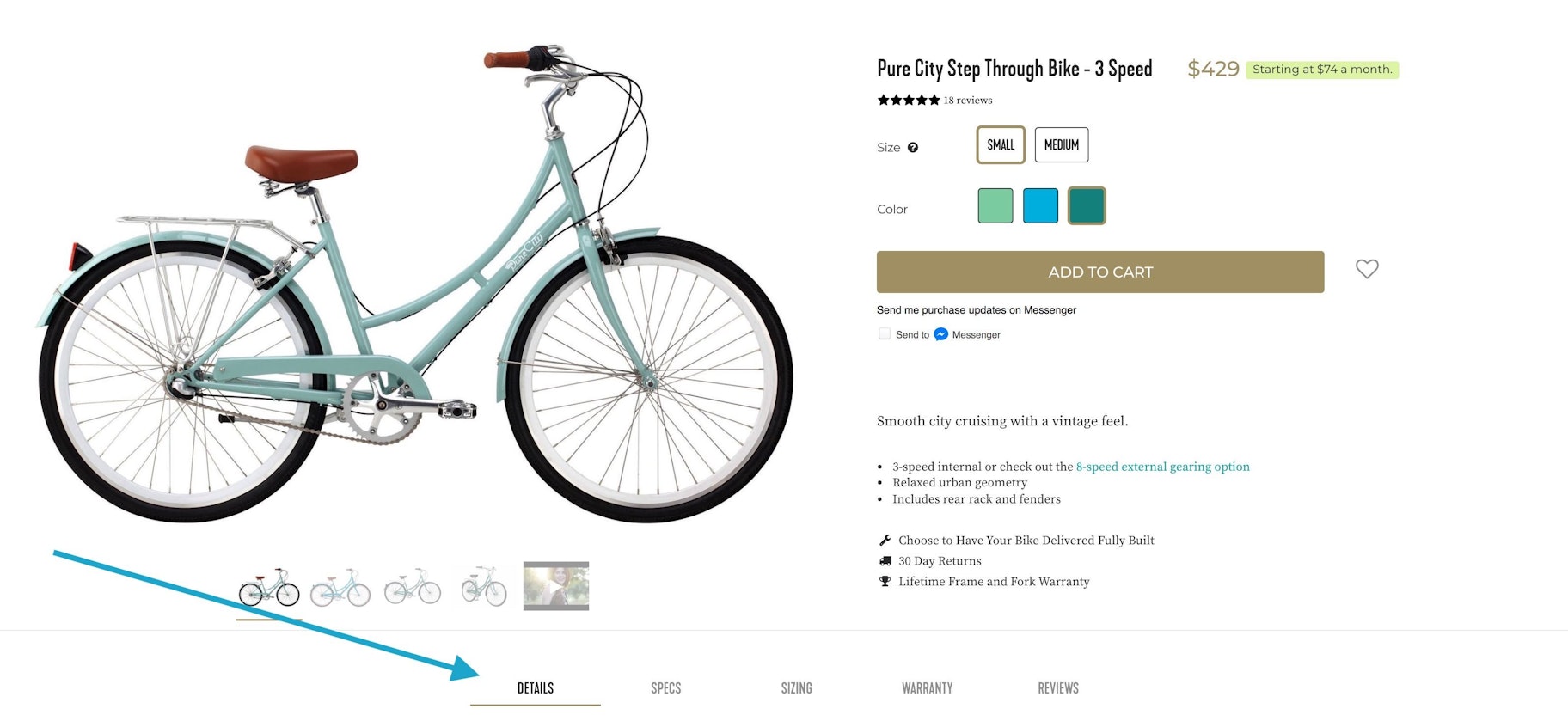
4. Lovely video
Finally, the video embedded among the product photos.
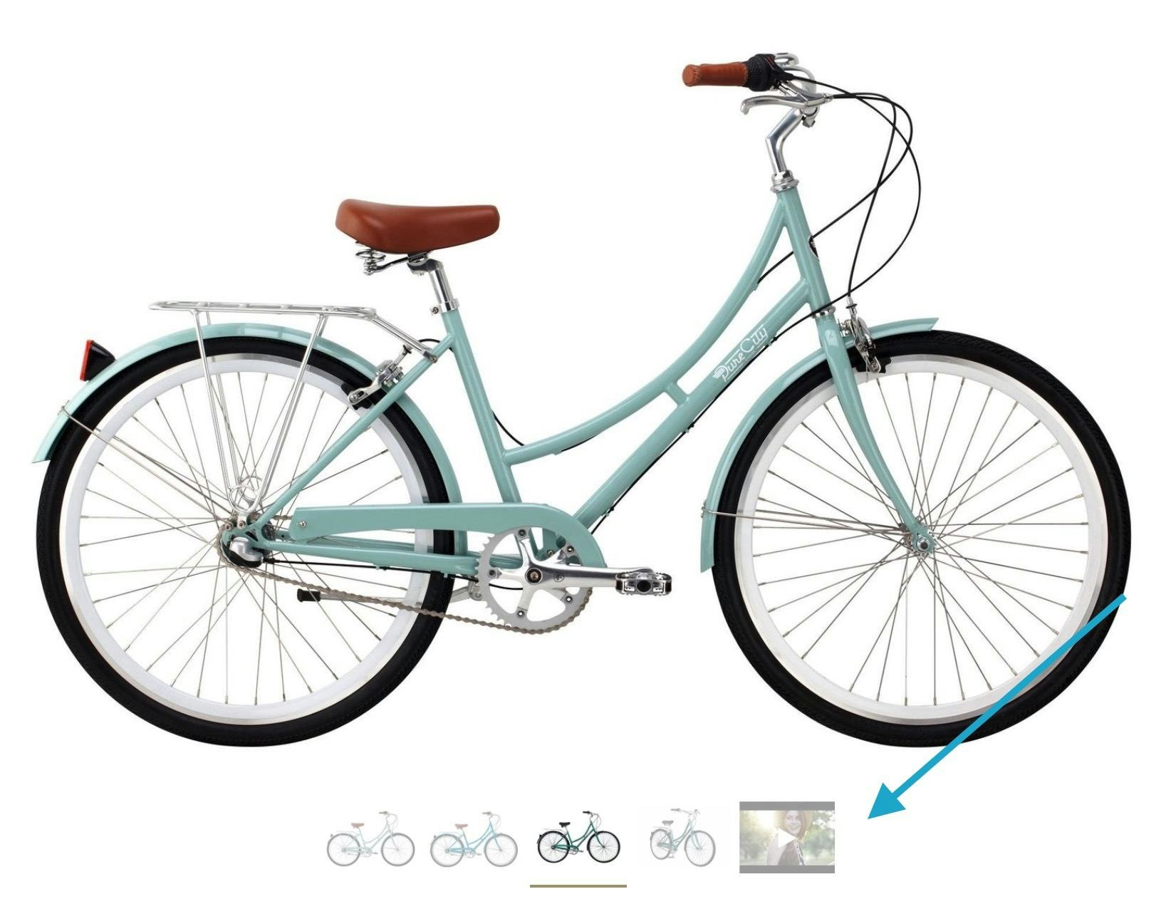
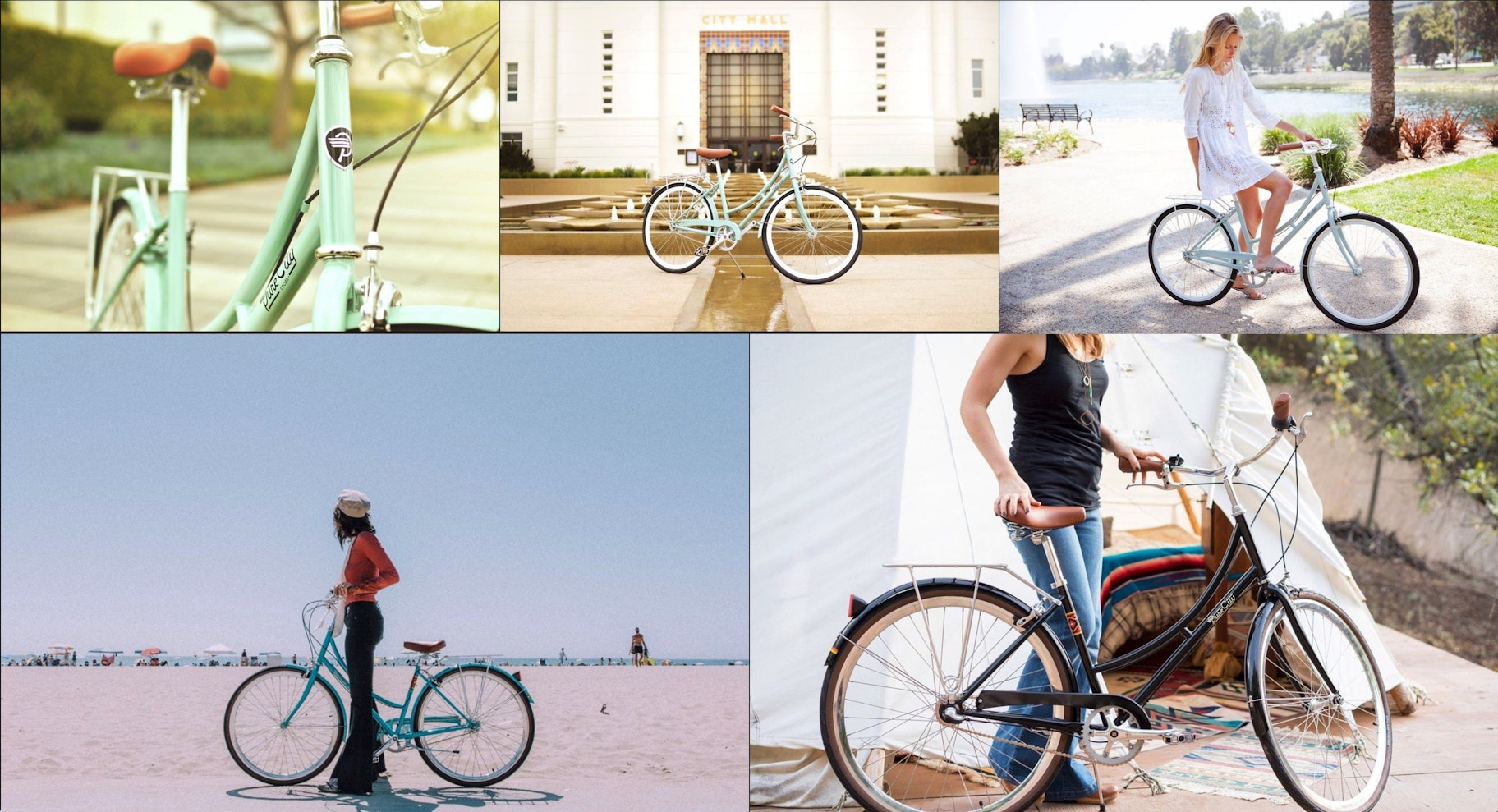
Click that, and you get this. Nothing wrong with 50 seconds of two good-looking people enjoying life with their Pure Cycles bicycles:
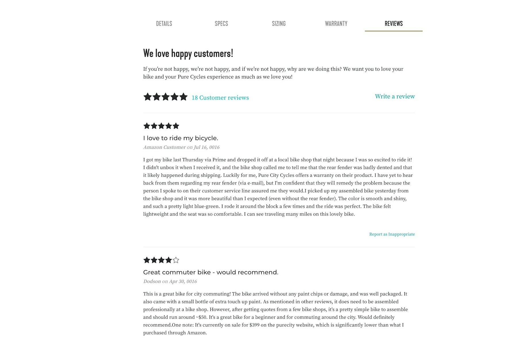
The rest of the Pure Cycles product page is predictably beautiful. Pure Cycles loads it up with customer reviews, photos, social media plugs, and shipping details — stuff that definitely wouldn’t have fit up there next to the Add To Cart button.
A Quick Word About Product Page Videos
Now, if you just watched that Pure Cycles video, you might be thinking, “How the &%$^ am I going to create something like that?”
No doubt, that video is pretty slick. Stuff like that doesn’t appear out of thin air.
But videos aren’t impossible!
Don’t believe me? Let’s suppose that a small store started selling sweatshirts. Sweatshirts are an item like that could definitely use a video on the product page – so the store should cook up one!
Sure, that video won’t get any standing ovations. And you’re forgiven if you aren’t dying to buy one of those sweatshirts. But don’t roll your eyes at the idea of doing video! This isn’t just something for big brands. The barrier to entry has been reduced to having some strong coffee and an iPhone.
Okay, moving on to our next store.
Master & Dynamic
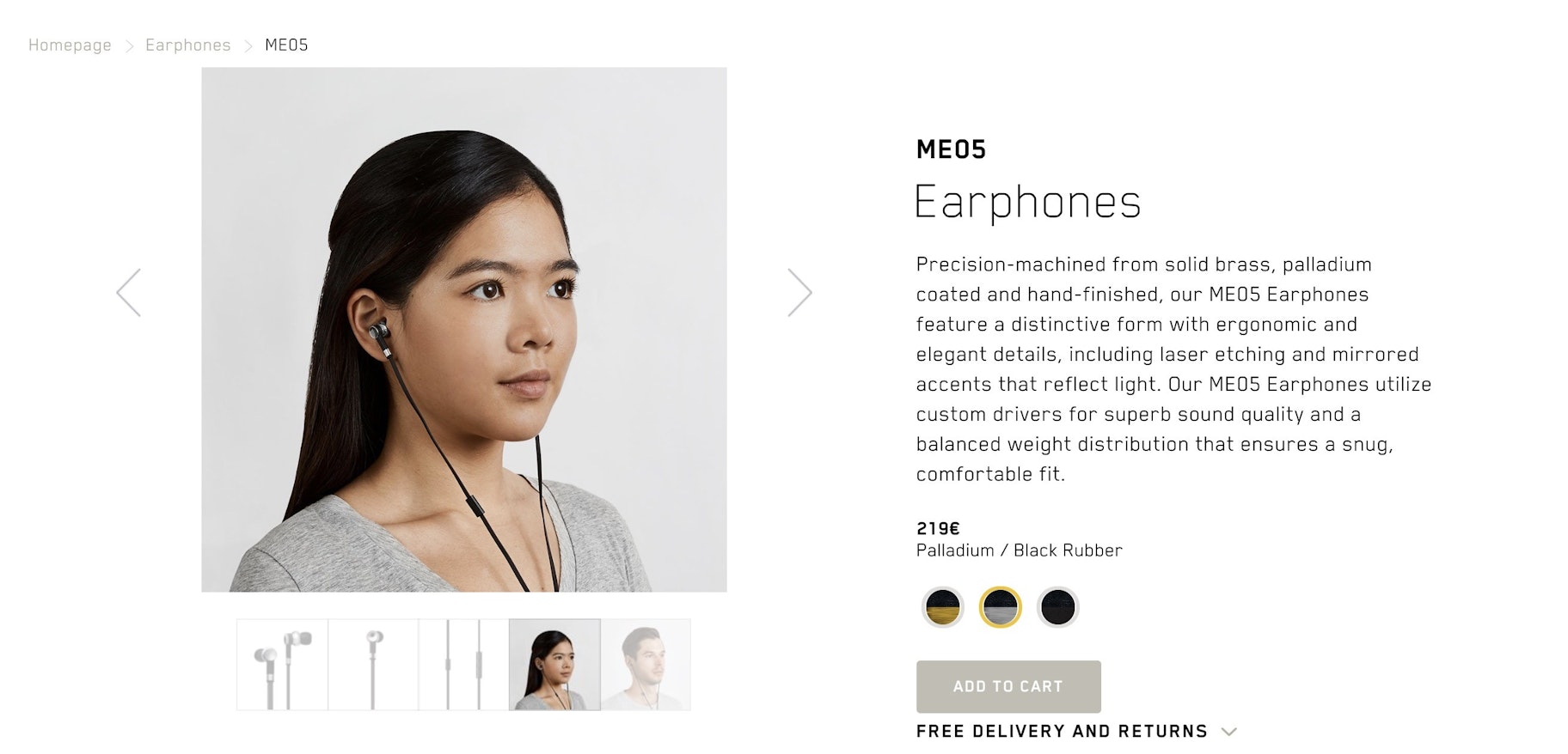
Master & Dynamic sells high-end audio accessories. The top of the product page is relatively normal…
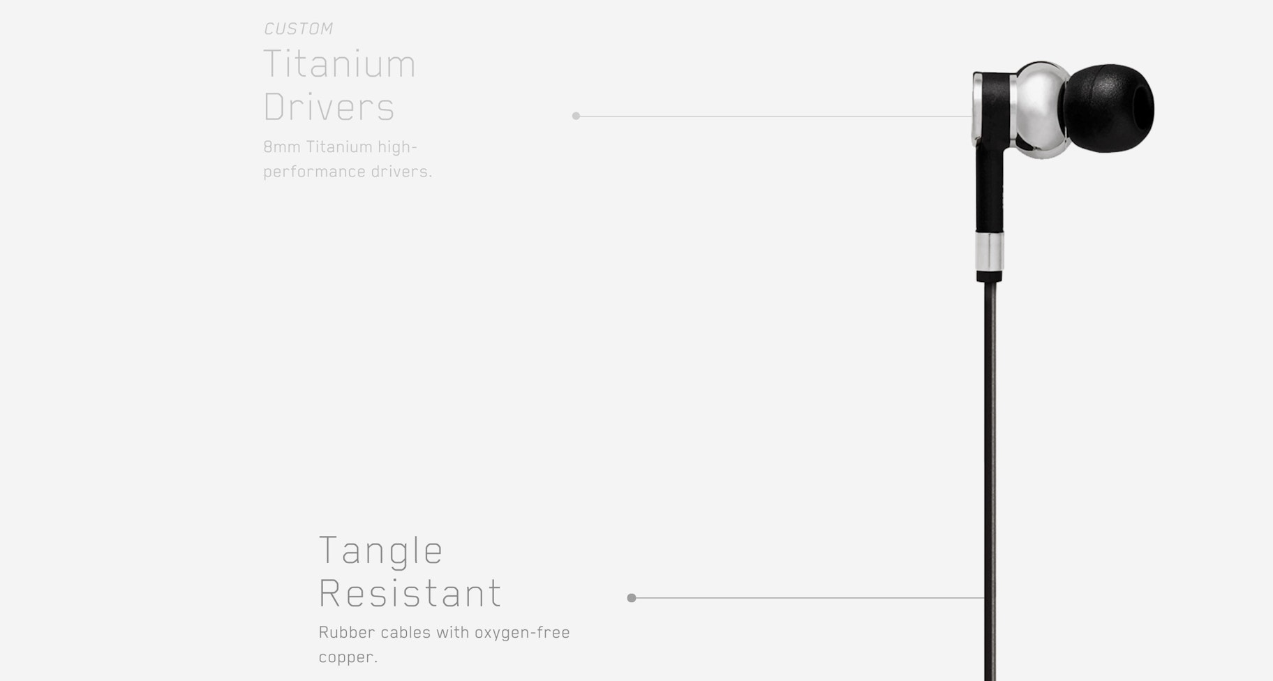
Here is that Master & Dynamic product page below the fold – a quasi timeline of features:
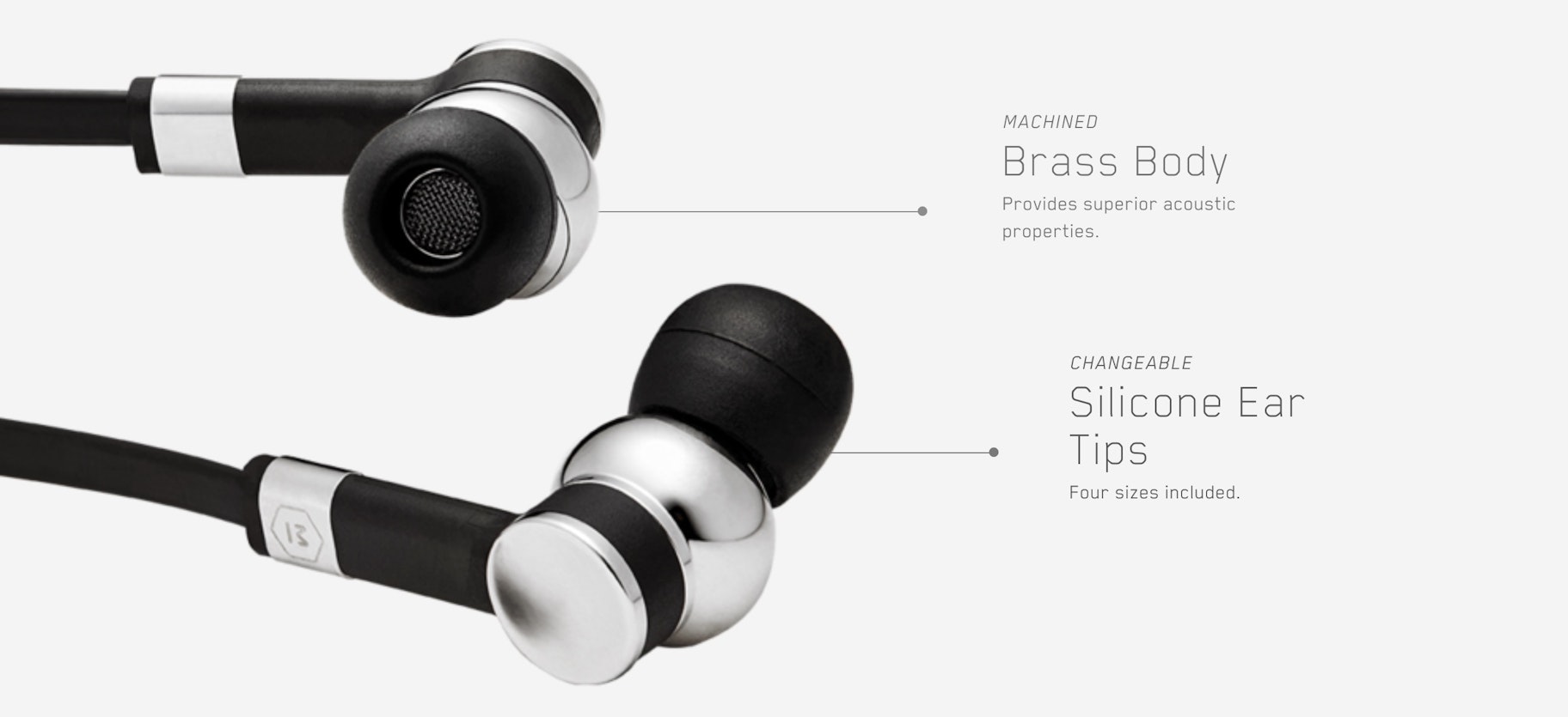
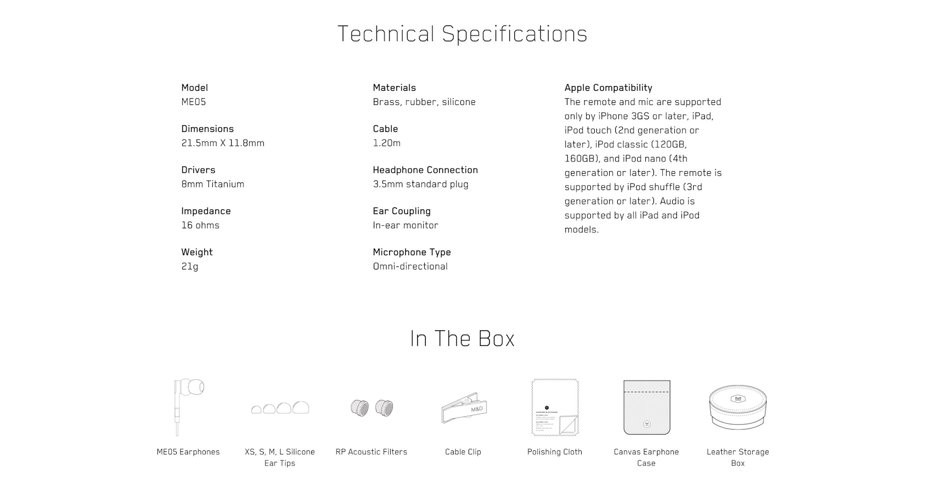
MW60 Wireless Over-Ear Headphones
Sunday Supply
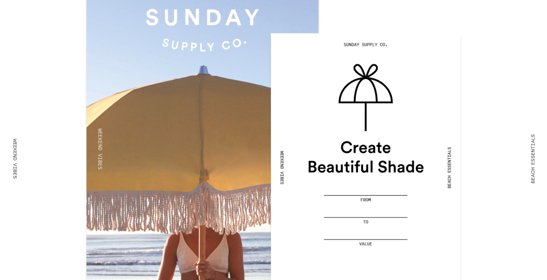
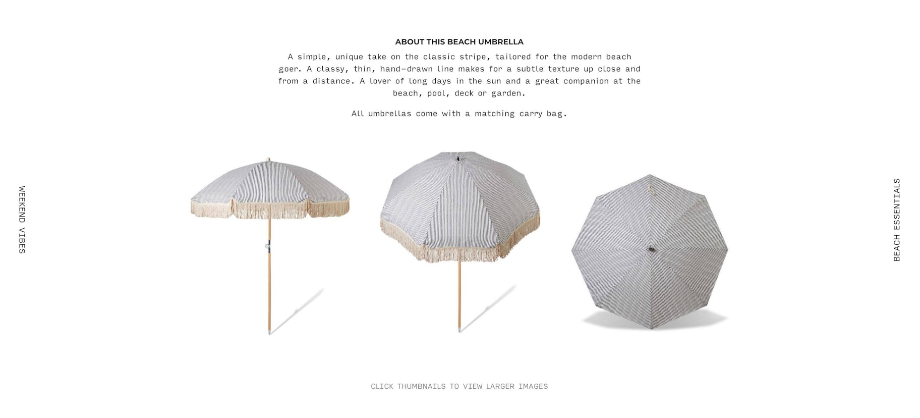
Sunday Supply, an Australian store that sells beach umbrellas, goes big with its product pages. Like, literally big.
They ignore the standard “product on the left, details on the right” layout and instead go all out with enormous pics:
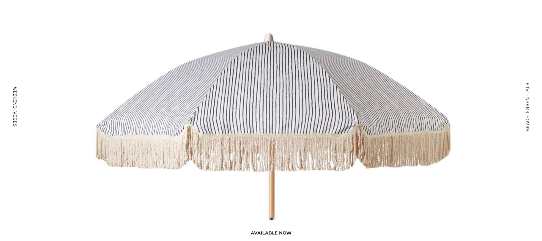
You then come across some product details that are written in an irresistibly charming voice, giving the umbrella human qualities like being “a lover of long days in the sun and a great companion.”
As any shop selling beach gear would be wise to do, Sunday Supply also shows its products out in the wild. When you can use the ocean as your backdrop, why not?
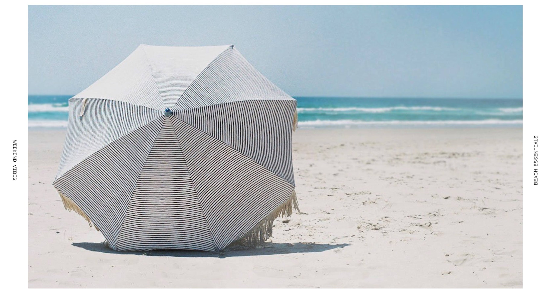
Natural Instinct Beach Umbrella
Studio Neat
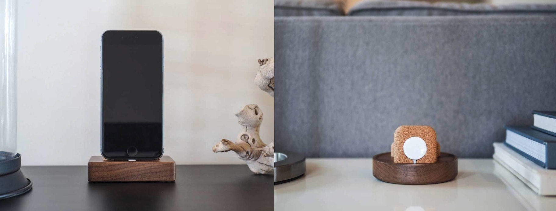
Studio Neat’s device storage and charging units have product pages that are every bit as classy as the chic items they’re selling.
The infrastructure of the page is standard but exceptionally executed. The two sentences of description text let you visualize how the item would look at your place – “On your nightstand or at your desk…” – and touches like the circular image give it some pop.
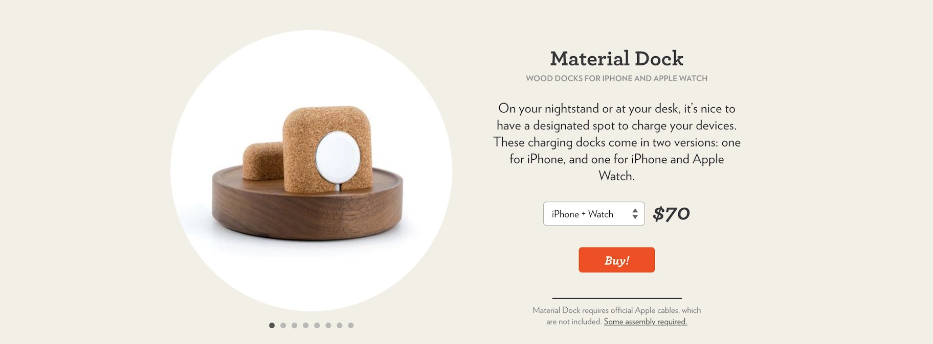
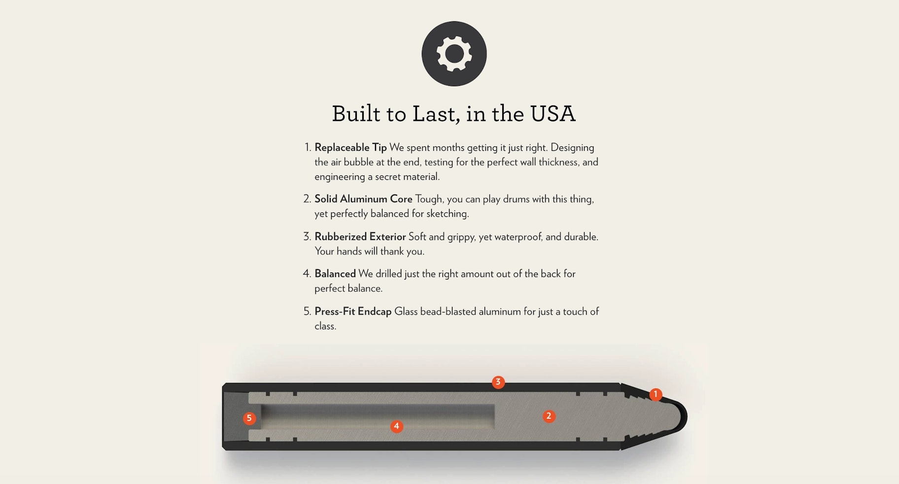
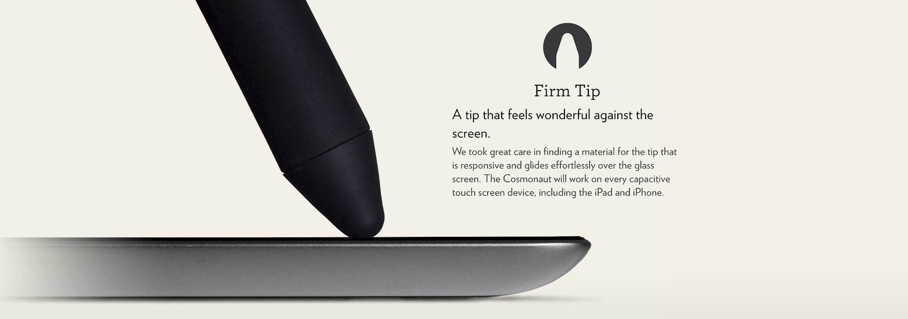
Then the product page turns into a visual tour of the features that you could expect if you bought this docking station. All the while, there are accents of casual text (“So no matter how you roll, you’ll have a spot for your devices”).


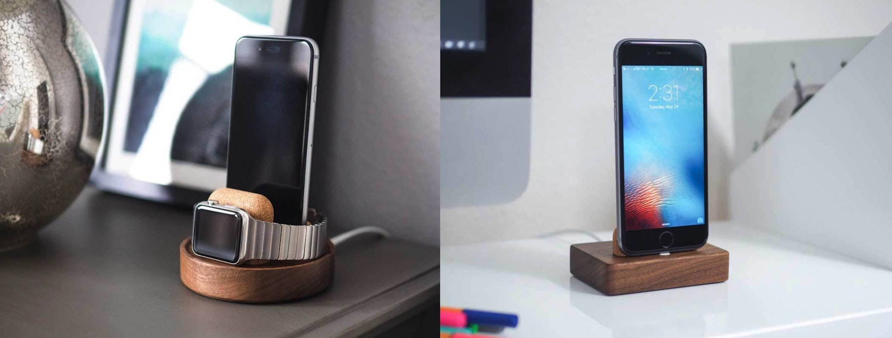
Finally, the product page includes some shots of this phone dock around the house and office.
Conclusions on Product Pages
These product pages all share a few things in common. Let’s hit on them tl;dr style.
There’s lots of space – use it
These product pages don’t let pixels go to waste, nor do they shy away from making the shopper scroll a little bit. Product pages were born in magazines and newspapers, where space was precious. But online, you don’t have to choose between that extra picture versus that extra bit of detailed information. Use it all.
Videos and huge pictures
We’ve touched on videos. You should do videos! And of course don’t forget the photos. These pages have exquisite images. If you’re a dropshipper, that means you shouldn’t just use your suppliers’ photos. Order your products, and take your own. You don’t need to be selling bikes or high-tech audio gear for your product photos to come to life.
Conversion is still possible at the top of the page
These jaw-dropping product pages will help convert people who are on the fence about purchasing. That’s why we see photos and videos and fancy layouts. But don’t forget about the people who already have their credit cards out! If someone is ready to buy, do what these stores do and make it possible to purchase items without scrolling or searching.
Want to learn more?
Here are some other articles that will help you nail your product pages!
